


How to Get the Best Results from Your Edge-Lit Sign
Designing your custom LED sign is simple—but a few key principles will make the difference between something that looks okay and something that looks incredible, professional, and easy to read from across the room.
Whether you're creating a logo sign, QR code sign, or custom artwork, this guide will help you get the best possible result.
How Edge-Lit Signs Work (Quick Explanation)
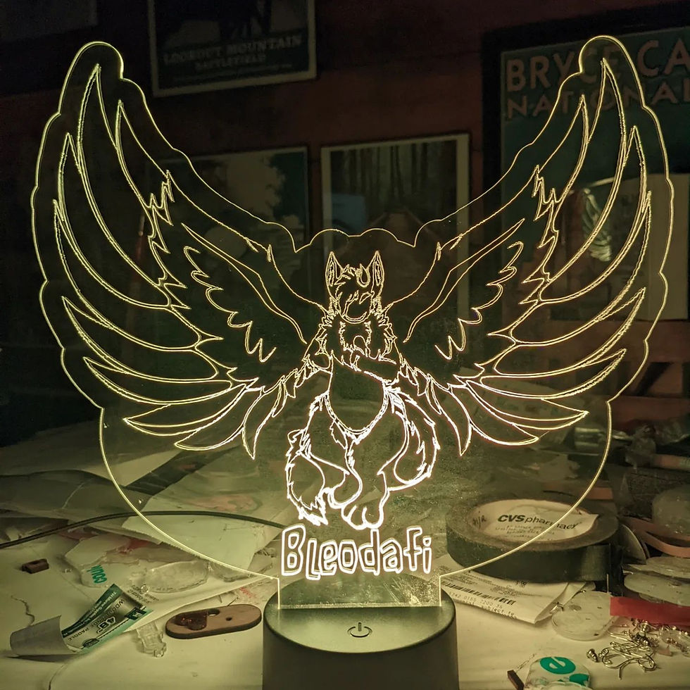
Edge-lit LED signs don’t glow like traditional backlit signs. Instead, light travels through the acrylic and illuminates the engraved lines and edges of your design.
That means your design shows up as clean, glowing line work—not filled-in solid shapes.
What this means for you:
-
Bold lines = brighter glow
-
Clean shapes = clearer visibility
-
Simpler designs = stronger impact
Best Design Practices (For All Signs)
Use Bold, Clean Lines
Thin or overly detailed lines won’t glow as brightly.
Best results:
-
Medium to thick line weight
-
Simple outlines
-
Minimal fine detail
Keep It High Contrast
Your design should be easy to “read” at a glance.
Best results:
-
Black-and-white artwork works best
-
Avoid gradients, shadows, and textures
-
Clean vector-style designs are ideal
Simplify When Needed
Highly detailed logos or artwork may need slight adjustments to look their best when engraved.
Don’t worry—we’ll help optimize your design if needed.
Designing a QR Code Sign (For DJs, Vendors & Events)
Keep the QR Code Clear & Unobstructed
-
No overlapping graphics
-
No heavy textures or backgrounds
-
Plenty of spacing around the code
Pair with Simple Text
Add a clear call-to-action like:
-
“Scan to Tip”
-
“Follow Me”
-
“Request a Song”
Keep fonts bold and easy to read.
Optimize for Low-Light Scanning
Your sign will likely be used in dark environments. It's best to focus on strong contrast, minimal clutter, and a clean layout.
Designing a Logo Sign (For Businesses & Brands)
Avoid Ultra-Fine Details
Small text and intricate elements can get lost.
Focus on Shape & Readability
Your logo should be recognizable from a distance.
Consider simplifying
Some logos benefit from a slightly cleaner version specifically for LED use.
What to Avoid
Avoid these common mistakes:
-
❌ Thin, sketch-style lines
-
❌ Overly detailed artwork
-
❌ Gradients or shading
-
❌ Busy layouts
-
❌ Tiny text
-
❌ Low-contrast designs
File Types We Recommend
For best results, upload:
-
SVG (preferred)
-
PDF
-
High-resolution PNG or JPG (black and white)
We’ll Help You Get It Right
Not a designer? No problem.